Sticker Messages
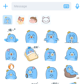
The content input box in the Global IM UIKit chat UI includes a sticker button to expand the sticker panel.

Clicking the button displays the sticker panel, allowing app users to send sticker messages.
Important
By default, Global IM UIKit only provides the sticker display panel. The sticker resources must be supplied by the app to Global IM UIKit.
Adding Sticker Packs
Apps can add custom stickers to the chat UI sticker panel in the following two ways.
Adding Sticker Packs via Local Path
-
Add a sticker pack JSON file via a local path. The format is as follows:
{
  "stickerPackage": {
            "packageId": "c60plBGwk2686yv4vmv4H9",
            "icon": "base64Str"
  },
  "stickers": [
        {
            "stickerId": "d1PN1xTZ47p9nfMNWfGpyH",
            "height": 240,
            "width": 240,
            "icon": "base64Str"
        },
        {
            "stickerId": "euV-LiASA9Nax4eeRgVCbW",
            "height": 240,
            "width": 240,
            "icon": "base64Str"
        }
  ]
}tipThe
iconis a base64 string of the thumbnail. -
Override the
onBindInputPanelComponentmethod in theChatFragmentto add sticker paths using theaddStickerPackagesWithJsonPaths(@NonNull List<String> paths)method ofInputPanelComponent.public class CustomChatFragment extends ChatFragment {
@Override
protected void onBindInputPanelComponent(@NonNull ChatModule module, @NonNull ChatViewModel viewModel) {
super.onBindInputPanelComponent(module, viewModel);
// Option 1
module.getInputPanelComponent().addStickerPackagesWithJsonPaths(new ArrayList<>());
}
}
Loading Stickers via StickerDataProvider
Set up the sticker provider.
public class CustomChatFragment extends ChatFragment {
    @Override
    protected void onBindInputPanelComponent(@NonNull ChatModule module, @NonNull ChatViewModel viewModel) {
        super.onBindInputPanelComponent(module, viewModel);
        // Option 2
        module.getInputPanelComponent().addStickerDataProvider(new StickerDataProvider() {
            @NonNull
            @Override
            public List<StickerPackage> getStickerPackage() {
                // Return sticker packs
                return new ArrayList<StickerPackage>();
            }
        });
    }
}
Displaying Sticker Messages
By default, stickers are displayed as thumbnails. To display the full-size sticker, you can set up a sticker image provider:
public class CustomChatFragment extends ChatFragment {
    @Override
    protected void onBindMessageListComponent(@NonNull ChatModule module, @NonNull ChatViewModel viewModel) {
        super.onBindMessageListComponent(module, viewModel);
        // Display the actual sticker
        ConfigCenter.getChatConfig().setStickerViewDataProvider(new StickerViewDataProvider() {
            @NonNull
            @Override
            public String getDisplayStickerLocalUrl(@NonNull String packageId, @NonNull String stickerId) {
                // Return the full-size sticker based on packageId and stickerId
                return null;
            }
        });
    }
}
Hiding the Sticker Button
The sticker button is distinguished by its class, as shown below:
| Function | Class |
|---|---|
| Sticker Button | KeyboardInputAction |
Example code to hide the sticker button:
public class CustomInputPanelComponent extends InputPanelComponent{

    @NonNull
    @Override
    protected List<InputAction> beforeCreateRightInputActionView(@NonNull List<InputAction> rightInputActions) {
        // Remove the sticker button
        Iterator<InputAction> iterator = rightInputActions.iterator();
        while (iterator.hasNext()) {
            InputAction inputAction = iterator.next();
            if (inputAction instanceof KeyboardInputAction) {
                iterator.remove();
            }
        }
        return super.beforeCreateRightInputActionView(rightInputActions);
    }
}