Chat UI
The chat UI is the chat page within the application, primarily composed of the message list and the input area. Global IM UIKit provides a default chat page Activity class and a chat page implemented based on the Fragment class.
- Activity-based: The default conversation list
ChatActivityprovided by Global IM UIKit. When the SDK needs to navigate to the conversation list internally, it will redirect to the default conversation list Activity. - Fragment-based: You can integrate the conversation list
ChatFragmentprovided by Global IM UIKit into your application Activity, thus customizing the conversation list Activity. Note that you need to register the custom conversation list Activity with the Global IM UIKit SDK to replace the default conversation list Activity provided by Global IM UIKit.
Chat Interface
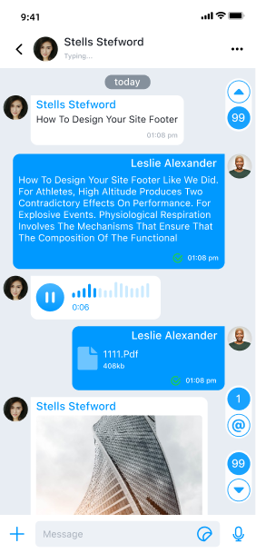
The chat interface generally consists of three parts: the navigation bar, the message list, and the input area.
Chat Page Structure
- ChatActivity: Provides a container for
ChatFragmentwithout specific implementation. - ChatFragment: Binds
ViewModeland variouscomponentswithin the page, and provides data source capabilities to the components. - ChatModule: Responsible for the UI display of
ChatFragmentand initializes the variouscomponentson the current page. - ChatViewModel: Provides the data source for the conversation list page and interfaces for all operations.
Conversation List Page Components
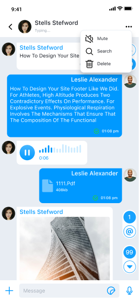
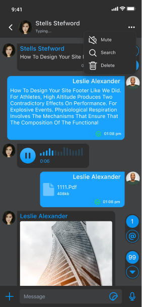
- ChatHeaderComponent: Navigation component that displays the
connection status promptand amorebutton. Global IM UIKit has default implementations forenable notifications,search, anddelete messagefunctionalities. - ChatSelectHeaderComponent: Multi-select mode component. Long-pressing a message and clicking
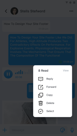
selectin the popup triggers the multi-select mode, displaying this component. - MessageListComponent: Message list component that displays all messages in chronological order. Long-pressing a message triggers a default popup. Global IM UIKit has default implementations for
reply,forward,copy,delete, andselectfunctionalities. The message list view is created and customized inBaseMessageItemProviderand the display templates for various message types. You can also use MessageListAdapter to customize each item in the list view. - InputPanelComponent: Message input component where users can input text, files, voice, images, videos, etc.
- MentionMemberComponent: Mention member component, used in group chats to display the current group's user list, triggered by entering @ in the message input component.
- ChatSelectBottomComponent: Multi-select mode component. Long-pressing a message and clicking
selectin the popup triggers the multi-select mode, displaying this component. - PageStatusComponent: Page status component displayed when the current conversation list has no data.
Usage
Global IM UIKit provides Activity and Fragment to create the chat page. ChatActivity is the default chat page provided. You can choose to directly use the default chat page Activity, inherit ChatActivity, or use ChatListFragment to build a custom conversation list Activity as needed.
Launching the Chat Page
There are two ways to launch the chat page Activity: by calling the SDK's built-in Activity router or by intent jump. You can also customize the chat page launch method to start the chat page from other Activities in the application.
Global IM UIKit has default implementations for the chat page jump logic. By default, clicking a conversation item in the conversation list page will automatically navigate to
ChatActivity, and the application layer does not need to handle it.
Using RouteUtil
RouteUtil is the built-in Activity router in Global IM UIKit, encapsulating the SDK's internal page jump methods to avoid repetitive intent encapsulation in the application.
If you have built a custom conversation Activity, you must first register the custom Activity with
RouteUtilto jump to the custom conversation Activity this way; otherwise, it will jump to the SDK's defaultChatActivity.
Jump to the conversation Activity:
String targetId = "userId";
ConversationIdentifier conversationIdentifier = new ConversationIdentifier(Conversation.ConversationType.PRIVATE, targetId);

RouteUtil.routeToChatActivity(context, conversationIdentifier)
| Parameter | Type | Description |
|---|---|---|
| context | Context | Activity context |
| conversationIdentifier | ConversationIdentifier | Conversation type |
| bundle | Bundle | Extended parameters |
Jumping via Intent
You can assemble the Intent yourself and use the default Android mechanism to jump.
Intent intent = new Intent(context, ConversationActivity.class);
intent.putExtra(RouteUtil.CONVERSATION_TYPE, type.getName().toLowerCase());
intent.putExtra(RouteUtil.TARGET_ID, targetId);
intent.putExtras(bundle);
context.startActivity(intent);
Inheriting the Default Chat Page Activity
You can create a custom conversation Activity by inheriting ChatActivity to adjust the chat page. Note that you must register the custom conversation Activity with RouteUtil. After registration, the custom conversation Activity will replace the default conversation Activity in Global IM UIKit. Once replaced, when clicking a conversation in the conversation list page, the SDK will jump to your registered custom conversation Activity. The registration method should be called once in the application lifecycle, in the main process.
RouteUtil.registerActivity(RouteUtil.ActivityType.CHAT_ACTIVITY, MyChatActivity.class)
Using Custom ChatFragment to Build a Custom Conversation List
The conversation list Fragment class provided by Global IM UIKit is named ChatFragment. To facilitate customizing the conversation list page in the application, it is recommended to inherit and use the conversation list ChatFragment class to build a custom conversation list Activity. By overriding factory methods
-
You first need to inherit
KitFragmentFactoryto override the methods of the Fragment you wish to customize. Refer to the code below as an example.public class CustomFragmentFactory extends KitFragmentFactory {
@NonNull
@Override
public Fragment newChatFragment(@NonNull Bundle args) {
return new ChatFragment.Builder()
.withArguments(args)
.setCustomFragment(new CustomChatFragment())
.build();
}
} -
Replace the custom KitFragmentFactory in the Application using ConfigCenter.setKitFragmentFactory(KitFragmentFactory).
public class CustomApplication extends Application {

   @Override
   public void onCreate() {
       super.onCreate();
       ConfigCenter.setKitFragmentFactory(new CustomFragmentFactory());
   }
}
Customization
You can customize the chat page by modifying the Global IM UIKit global configuration and overriding methods in ChatActivity or ChatFragment.
Before starting customization, it is recommended to first inherit the SDK's built-in chat page ChatActivity or inherit and use ChatFragment to create and implement your own chat page Activity.
Some styles and behaviors in the chat page are affected by the Global IM UIKit global configuration. For global configuration, refer to Configuration Guide.
Modifying Navigation Bar Style and Functionality
Global IM UIKit supports customizing components, such as adding an icon and click event to the right area of the navigation bar. Use the ChatHeaderComponent provided by Global IM UIKit to add or remove Views.
public class CustomChatFragment extends ChatFragment {

    @Override
    protected void onBindHeaderComponent(@NonNull ChatModule module, @NonNull ChatViewModel viewModel) {
        super.onBindHeaderComponent(module, viewModel);

        // Navigation bar left - add View at specified position
        module.getHeaderComponent().addLeftView(new View(getContext()), 0);
        // Navigation bar left - remove View at specified position
        module.getHeaderComponent().removeLeftView(0);

        // Navigation bar center - add View at specified position
        module.getHeaderComponent().addCenterView(new View(getContext()), 0);
        // Navigation bar center - remove View at specified position
        module.getHeaderComponent().removeCenterView(0);
    }
}
Modifying Multi-select Mode Navigation Bar Component Style and Functionality
-
Inherit the
ChatSelectHeaderComponentfrom Global IM UIKit to create asubclass, override the onCreateView method, and return a custom layout. For example,CustomChatSelectHeaderComponent.public class CustomChatSelectHeaderComponent extends ChatSelectHeaderComponent {
public CustomChatSelectHeaderComponent(Context context) {
super(context);
}
public CustomChatSelectHeaderComponent(@NonNull Context context, @Nullable AttributeSet attrs) {
super(context, attrs);
}
@Override
public View onCreateView(@NonNull Context context, @NonNull LayoutInflater layoutInflater, @NonNull ViewGroup parent, @Nullable AttributeSet attrs) {
// Return custom layout
return super.onCreateView(context, layoutInflater, parent, attrs);
}
@Override
public void notifyStatus(int checkedNum) {
super.notifyStatus(checkedNum);
}
} -
Copy
global IM Kit'src_chat_module.xmlto themain project'sres/layout, find<com.rongcloud.im.uikit.chat.component.ChatSelectHeaderComponent />and replace it with the subclass's full path<com.rongcloud.im.uikit.custom.component.CustomChatSelectHeaderComponent />.Before change:
<?xml version="1.0" encoding="utf-8"?>
<FrameLayout xmlns:android="http://schemas.android.com/apk/res/android"
    android:orientation="vertical"
    android:layout_width="match_parent"
    android:layout_height="match_parent">

    <com.rongcloud.im.uikit.chat.component.ChatSelectHeaderComponent
        android:id="@+id/rc_select_header_component"
        android:layout_width="match_parent"
        android:layout_height="wrap_content"
        android:visibility="gone" />

    // Other componentsxx

</FrameLayout>
After change:
<?xml version="1.0" encoding="utf-8"?>
<FrameLayout xmlns:android="http://schemas.android.com/apk/res/android"
    android:orientation="vertical"
    android:layout_width="match_parent"
    android:layout_height="match_parent">

    // Only replace the custom component, other components need to be retained (Note: do not modify the android:id of the component)
    <com.rongcloud.im.uikit.custom.component.CustomChatSelectHeaderComponent
        android:id="@+id/rc_select_header_component"
        android:layout_width="match_parent"
        android:layout_height="wrap_content"
        android:visibility="gone" />

    // Other componentsxx

</FrameLayout>
Modifying Multi-select Mode Bottom Component Style and Functionality
-
Inherit the
ChatSelectBottomComponentfrom Global IM UIKit to create asubclass, for example,CustomChatSelectBottomComponent.public class CustomChatSelectBottomComponent extends ChatSelectBottomComponent {
public CustomChatSelectBottomComponent(Context context) {
super(context);
}
public CustomChatSelectBottomComponent(@NonNull Context context, @Nullable AttributeSet attrs) {
super(context, attrs);
}
@Override
protected List<MsgAction<List<UiMessage>>> beforeCreateMultiMsgActionView(List<MsgAction<List<UiMessage>>> msgActions) {
// Add
msgActions.add(new MsgAction<List<UiMessage>>() {
@Override
public String obtainTitle(@NonNull Context context) {
return "delete";
}
@Override
public Drawable obtainDrawable(@NonNull Context context) {
return ResourcesCompat.getDrawable(context.getResources(), com.rongcloud.im.uikit.R.drawable.rc_icon_delete,
null);
}
@Override
public void onClick(@NonNull View view, @NonNull List<UiMessage> data) {
Toast.makeText(getContext(), "delete Clicked", Toast.LENGTH_SHORT).show();
}
});
return super.beforeCreateMultiMsgActionView(msgActions);
}
} -
Copy
global IM Kit'src_chat_module.xmlto themain project'sres/layout, find<com.rongcloud.im.uikit.chat.component.ChatSelectBottomComponent />and replace it with the subclass's full path<com.rongcloud.im.uikit.custom.component.CustomChatSelectBottomComponent />.Before change:
<?xml version="1.0" encoding="utf-8"?>
<FrameLayout xmlns:android="http://schemas.android.com/apk/res/android"
    android:orientation="vertical"
    android:layout_width="match_parent"
    android:layout_height="match_parent">

    <com.rongcloud.im.uikit.chat.component.ChatSelectBottomComponent
        android:id="@+id/rc_select_bottom_component"
        android:layout_width="match_parent"
        android:layout_height="wrap_content"
        android:visibility="gone" />

    // Other componentsxx

</FrameLayout>
After change:
<?xml version="1.0" encoding="utf-8"?>
<FrameLayout xmlns:android="http://schemas.android.com/apk/res/android"
    android:orientation="vertical"
    android:layout_width="match_parent"
    android:layout_height="match_parent">

    // Only replace the custom component, other components need to be retained (Note: do not modify the android:id of the component)
    <com.rongcloud.im.uikit.custom.component.CustomChatSelectBottomComponent
        android:id="@+id/rc_select_bottom_component"
        android:layout_width="match_parent"
        android:layout_height="wrap_content"
        android:visibility="gone" />

    // Other componentsxx

</FrameLayout>
Modifying User Avatar Shape
The user avatars displayed in the message list on the chat page (referring to the avatars displayed on the messages) can be modified through the Global IM UIKit global configuration.
The avatar shape is circular by default and can be modified to rectangular. The default avatar display size is 40dp*40dp. Call the following code after SDK initialization to set it up:
   ConfigCenter.getFeatureConfig().setKitImageEngine(new GlideKitImageEngine() {
            @Override
            public void loadChatPortrait(@NonNull Context context, @NonNull String url, @NonNull ImageView imageView, Conversation conversation) {
                Glide.with(context).load(url)
                        .into(imageView);
            }
        });
Modifying the Global IM UIKit global configuration affects the display of all user avatars in Global IM UIKit.
Adding Custom Empty Layout
Global IM UIKit's ChatListModule supports customizing the empty (Empty) view in the conversation list page.
- Method 1: Copy
global IM Kit'src_page_status_component.xmlto themain project'sres/layoutand implement your own UI view. - Method 2: Inherit the
PageStatusComponentfrom Global IM UIKit to create a subclass, overrideonCreateViewto implement your own UI view, and replace the original component with the custom component inrc_chat_list_module.xml.
Displaying Network Connection Status Prompt
When the connection is lost or reconnected, the SDK will display a connection status prompt bar at the top of the conversation list page and the chat page.
To disable this prompt on the conversation list page, call the following code after App initialization:
ConfigCenter.setShowConnectingStatus(false)
Clearing Notification Bar Notifications
Global IM UIKit supports clearing all notifications in the notification panel when opening the chat page and the conversation list page. This switch is turned off by default in Global IM UIKit, meaning notifications are not cleared.
To clear notifications when on the conversation list page, call the following code after App initialization:
ConfigCenter.getChatListConfig().setWipeOutNotificationMessage(true)
Modifying Long-press Message Menu
Global IM UIKit has default implementations for the long-press message menu in one-to-one and group chat pages. You can modify the display name, order, and add or delete menu options as needed. See Customizing Long-press Message Menu for details.
Other Customizations
You can continue to learn how to customize the chat page in the following documents: