Component Overview
Global IM UIKit provides a series of UI components to help developers quickly build IM business scenarios and meet customization requirements for different components. Currently, Global IM UIKit offers two types of components: Provider components and Component components.
All components are Web Components custom elements, which means you can manipulate them just like regular DOM elements.
Provider Components
Provider components are used to define container components closely related to IM business contexts. These components are internal business components of Global IM UIKit. To ensure stability, they cannot be customized by the business layer and only offer limited functionality through exposed component interfaces.
The naming convention for Provider components is <rc-xxxxxxxx-provider>, which starts with rc- and ends with -provider.
Component Components
Component components are stateless components that obtain external data through Props and render the UI based on that data. The business layer can customize the display effects of these components according to different business needs via Props.
The naming convention for Component components is <rc-xxxxxxxx>, which starts with rc-.
All Component component tag names can be obtained through the RCKitComponentTag constant.
Basic Layout Components
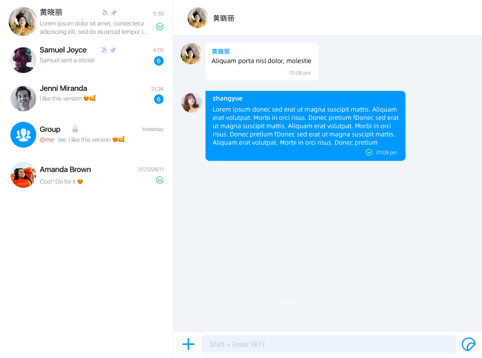
Global IM UIKit provides the <rc-imkit-app-provider> basic layout component to help developers quickly build IM business scenarios.

The core implementation of the basic layout component is as follows:
<template>
  <div class="rc-kit-app">
    <rc-conversation-list-container-provider class="list"></rc-conversation-list-container-provider>
    <rc-conversation-detail-provider class="detail"></rc-conversation-detail-provider>
  </div>
</template>

<style>
.rc-kit-app {
  width: 100%;
  height: 100%;
  display: flex;
  flex-direction: row;
}
.detail {
  flex: 1 auto;
  overflow: hidden;
}
.list {
  border-right: 1px solid #EFEFEF;
}
</style>
It includes two core sub-components, which are laid out side by side:
<rc-conversation-list-container-provider>: The conversation list container component.<rc-conversation-detail-provider>: The conversation detail container component, which also includes an input box component.
You can use the <rc-imkit-app-provider> component to quickly build your business or directly reference the two core business components, <rc-conversation-list-container-provider> and <rc-conversation-detail-provider>, to create a customized layout.
Displaying UI Components
Taking the <rc-imkit-app-provider> component as an example, after the IM connection is successfully established, you can choose to add this component to the DOM to display the chat UI.
const appElement = document.createElement('rc-imkit-app-provider');
// Define the component's width and height
appElement.style.width = '100%';
appElement.style.height = '100%';
// Add the component to the DOM
document.body.appendChild(appElement);